Creating eye-catching game day posters is crucial for any team or event, and at supremeduelist.blog, we understand the power of visual impact. Choosing the right fonts is a cornerstone of effective design, directly influencing how your message is received. The right font can make your poster pop and grab attention, while the wrong one can leave it flat and unengaging. We’ll explore fonts that are both effective and aesthetically pleasing for your next game day masterpiece.
In this article, we’ll dive into the world of typography, uncovering the Best Fonts For Game Day Posters. We’ll look at different font styles, their strengths, and when to use them to create a poster that truly stands out. We will discuss everything from bold sans-serifs to dynamic display fonts that can help elevate your game day posters and generate excitement.
Understanding the Importance of Font Choice
Choosing the right font for your game day poster is not just an aesthetic decision; it’s a crucial element that can influence the impact and readability of your design. The font you select helps to convey the mood, tone, and overall message of your poster. A strong, bold font can evoke a feeling of energy and excitement, while a sleek, modern font can convey professionalism and confidence. For instance, you wouldn’t use a delicate script font for a high-stakes football game, just as you wouldn’t use a heavy block font for a school chess tournament.
Beyond aesthetics, font choice directly impacts readability. If your font is difficult to read, your message will be lost, regardless of how fantastic your design is. Therefore, considering things like letter spacing, line height, and the size of the font in relation to its background is vital. This is especially important in busy and crowded environments where posters need to capture attention quickly. The right font will ensure that your message is seen and understood clearly.
Top Font Styles for Game Day Posters
When creating game day posters, several font styles consistently perform well. Each brings its own unique flair and suitability for various types of events. Here are some top font styles to consider:
Bold Sans-Serif Fonts
Sans-serif fonts are characterized by their clean, simple lines without the decorative “serifs” at the ends of strokes. They offer excellent readability and a contemporary feel, making them perfect for bold headlines and key information on game day posters. Fonts like Impact, Bebas Neue, and Montserrat are favorites due to their commanding presence and clarity. These fonts convey strength, urgency, and excitement, which are all highly desirable on posters trying to capture attention.
Dynamic Display Fonts
Display fonts are designed for visual impact, making them ideal for drawing attention to a poster’s main message. These fonts come in a wide variety of styles, from script fonts to retro-inspired designs. Some dynamic display fonts that work well for game day posters include Luckiest Guy, Permanent Marker, and Anton. These fonts are less about readability in long stretches of text and more about creating a strong, eye-catching statement. Display fonts add personality and character to your designs.
“The right display font can be the difference between a poster that’s overlooked and one that ignites excitement,” says Eleanor Vance, a professional graphic designer specializing in sports branding. “Don’t be afraid to experiment with different styles until you find the one that best represents the spirit of your event.”
Sturdy Slab-Serif Fonts
Slab-serif fonts, with their thick, block-like serifs, combine boldness with a touch of vintage charm. They are excellent for conveying a sense of strength and authority. Fonts like Rockwell, Roboto Slab, and Playfair Display are solid choices that offer a distinctive look, making them perfect for titles and key players’ names. Slab-serif fonts work well when you need a font that’s both eye-catching and rooted in tradition. They offer a sense of heritage while still looking bold and modern.
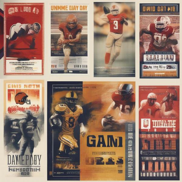 various-game-day-poster-fonts
Picking the Right Font: A Step-by-Step Guide
Selecting the right font for your game day poster can be simplified with a step-by-step approach. Here is how to choose the perfect typeface for your project:
- Define Your Purpose: Before looking at fonts, decide what your poster’s primary goal is. Are you promoting a championship game, a charity event, or just trying to boost team spirit? The purpose will influence the tone, mood, and style of your chosen font.
- Consider Your Audience: Who are you creating the poster for? Are they students, alumni, or general sports enthusiasts? The age, interests, and cultural background of your audience will affect the font style that resonates with them.
- Match the Font to the Sport: Different sports often have different associations and feelings that you can tap into with your font choice. For example, a classic, slightly vintage font might work well for baseball, while a high-impact, techy font might be appropriate for esports.
- Test Your Fonts: Once you have a few options in mind, test them out by creating mock-ups. Examine how the fonts look in different sizes, colors, and on different backgrounds. This helps ensure they’re readable and visually appealing.
- Limit Your Font Choices: Avoid using too many fonts on a single poster. Stick to a maximum of two or three font families. Too many fonts can make your poster look disorganized and unprofessional. Ideally, use one font for titles, another for body text or secondary information, and possibly a third, more unique font to draw attention to a specific element or logo.
- Evaluate Legibility: Ensure that your selected font is legible from a distance. Prioritize fonts that are clear, uncluttered, and have sufficient spacing between letters. You should make sure that the font remains clear in various sizes and on both dark and light backgrounds.
Where to Find Great Fonts for Game Day Posters
Finding high-quality fonts for your game day posters has never been easier with numerous online resources available.
- Google Fonts: Offers a vast library of free and open-source fonts. It is an excellent starting point for diverse font choices, catering to a wide range of design needs.
- Adobe Fonts: For those with an Adobe Creative Cloud subscription, the Adobe font library provides a range of high-quality options and includes a large selection of both free and paid options.
- Font Squirrel: A website focused exclusively on free, high-quality, and commercial-use fonts.
- MyFonts: An online marketplace where you can purchase fonts from independent designers. It has a wide range of styles, from basic to specialized, with options for both personal and professional use.
- Creative Market: A platform that offers a wide variety of design resources, including unique and diverse font options.
“Using the right font can transform a poster from good to great. Be sure to try out several different options to see which best conveys your message and captures the attention of your audience,” advises Samuel Reed, a typography expert for professional sports teams. “Don’t be afraid to take time experimenting and making adjustments. This will allow you to discover exactly what works for your design.”
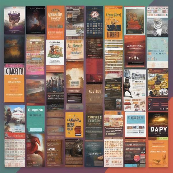 various-font-websites
SEO Optimization for Game Day Poster Fonts
When designing game day posters, think not only about the aesthetic but also about how your text will perform in searches. This is especially relevant if your poster will be shared online. Use the most popular search terms in order to make your designs more discoverable. This involves integrating certain primary, secondary, and related keywords into your design process. You should ensure that the poster not only looks good but is optimized for the user.
Primary Keywords
The primary keyword, “best fonts for game day posters,” should appear naturally within your content. This phrase is the key phrase that users are most likely to search when looking for this kind of information. By incorporating the primary keyword, you’re letting search engines know that your page is highly relevant to the search query.
Secondary Keywords
Secondary keywords like “game day poster fonts,” “sports fonts,” “poster typography,” and “readable fonts for posters,” help to broaden the relevance of your content. These keywords are closely related to your primary keyword and will attract a wider audience of users, as well as enhance your content’s credibility for search engines.
LSI (Latent Semantic Indexing) Keywords
LSI keywords are semantically related terms that help search engines understand the context of your content. Examples of these keywords for “best fonts for game day posters” include: “bold fonts,” “display fonts,” “sans-serif,” “slab-serif,” “font pairing,” “typography guidelines,” and “font legibility.” Incorporating these helps to build a comprehensive context of related terms and concepts for your work.
Optimization for Search Intent
Focusing on search intent means you are providing content that meets the needs of the users that are actively searching for it. For example, a user searching for “best fonts for game day posters” is likely looking for both font suggestions, design advice, and resources to choose the right font. Therefore, incorporating these aspects makes your content much more valuable to the user.
Optimizing for Voice Search
Voice searches are becoming increasingly common, meaning you need to optimize for more conversational queries. Use questions as subheadings like “What are the best fonts for game day posters?” to address common user queries. This is why answers should be brief, precise, and in a natural language style, which will cater directly to the user’s needs.
Conclusion
Choosing the best fonts for game day posters involves a blend of creative expression and practical considerations. By understanding the different font styles, considering your audience, and adhering to a few simple design principles, you can create posters that are both visually stunning and highly effective. For more insights and tips on graphic design and game-day preparation, keep an eye on supremeduelist.blog for all the latest industry trends. Use this guide to help you create the best game-day posters yet!
Ready to take your designs to the next level? Let us help you dominate the game day design, and check out other great insights at supremeduelist.blog.
Leave a Reply